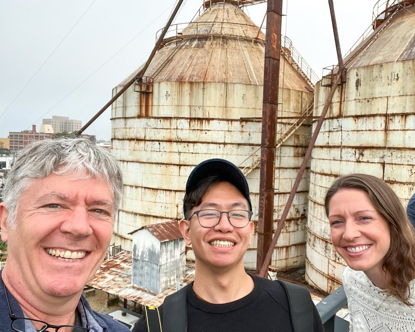
A few weeks ago, a group of Arrowstreeters set off to Waco and Austin, Texas on a brand research mission. Arrowstreet Principals Sean Selby and Lauren Haggerty, along with architect Edbert Cheng, visited the world-famous Magnolia Market at the Silos and YETI Flagship Store in Austin. They were particularly intrigued by how these retail environments contrasted with those we typically see in New England.
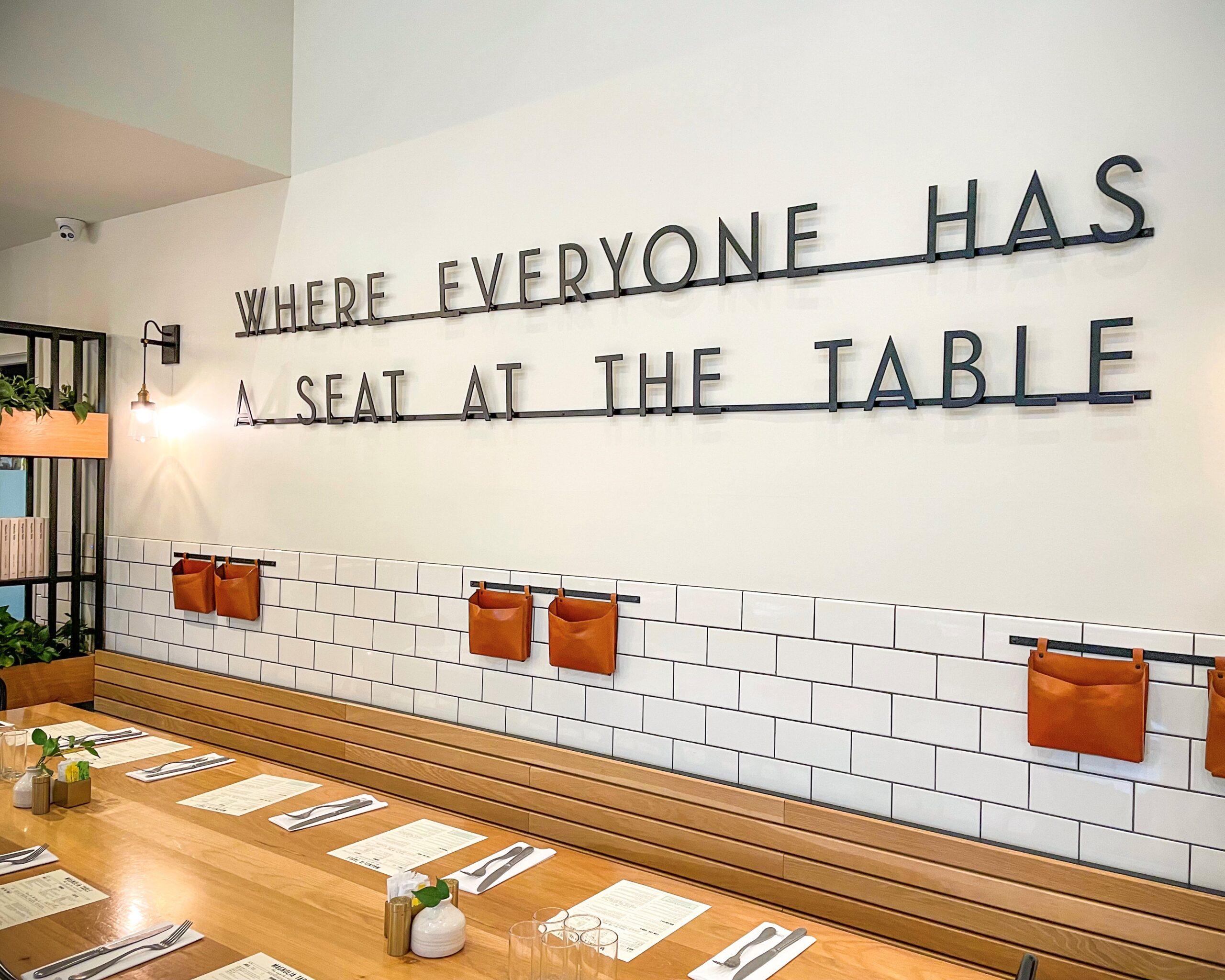
First stop: Magnolia Table. It would only be right to start the day with breakfast here. The interior design and decor are just the right appetizer for a day spent immersed in the Magnolia realm. After breakfast, the group journeyed to the famed Silos where they met their tour guide and enjoyed a free drink from Magnolia Press.

The Silos and surrounding grounds have been reimagined into welcoming and well-organized public spaces. Functionally, the complex emphasizes leisure, convenience, and familiarity. Beautifully landscaped pathways connect the retail stores (Magnolia Market, Magnolia Home, Magnolia Bakery, and six new shops), campus landmarks, and an incredible array of food and beverage options.

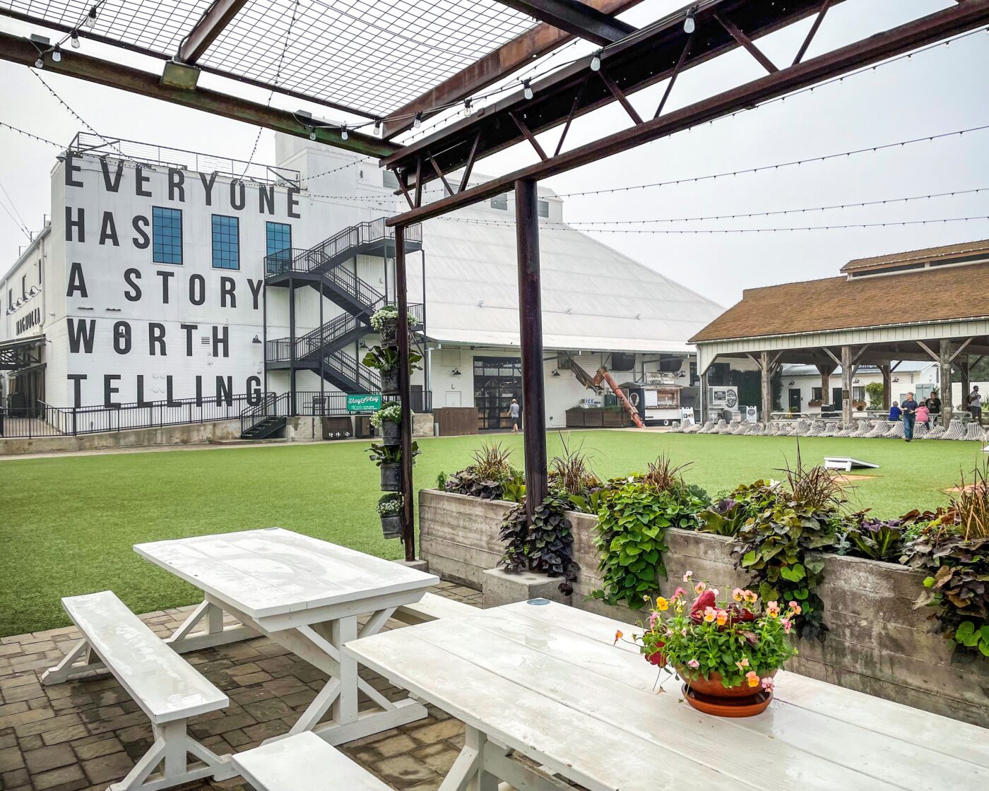
Immaculate green areas and public spaces are efficiently laid out for visitors to indulge themselves in the “mid-America town square” vibe. Every item on the campus is thoughtfully designed and curated to spark joy and inspiration. Moments of discovery are found throughout with eye-catching and insta-worthy designs in perfect scale, located in all corners of the campus.

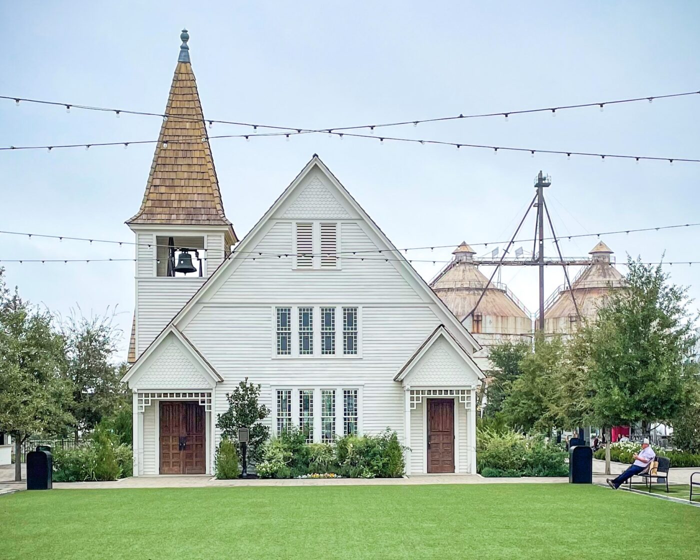
The building incorporates icons of American pastoral life to create an atmosphere of familiarity and nostalgia such as an historic barn, a wiffle ball field, an historic church, and the original silos that inspired the property. With design elements that emphasize nostalgia and play, the refurbished architecture adds a contemporary blend to the complex’s landscape while preserving its historic character. The vision was to create a space where visitors could spend the day and get inspired. It offers a small-town feeling within a growing city— a place that evokes inspiration, interaction, and engagement.

The second stop was the YETI Austin Flagship store. The building fits in seamlessly within the surrounding urban environment. It combines the functionality of a traditional retail store with the essence of a live music venue. An outdoor bar and patio are located at the entrance, naturally drawing in customers and passers-by.
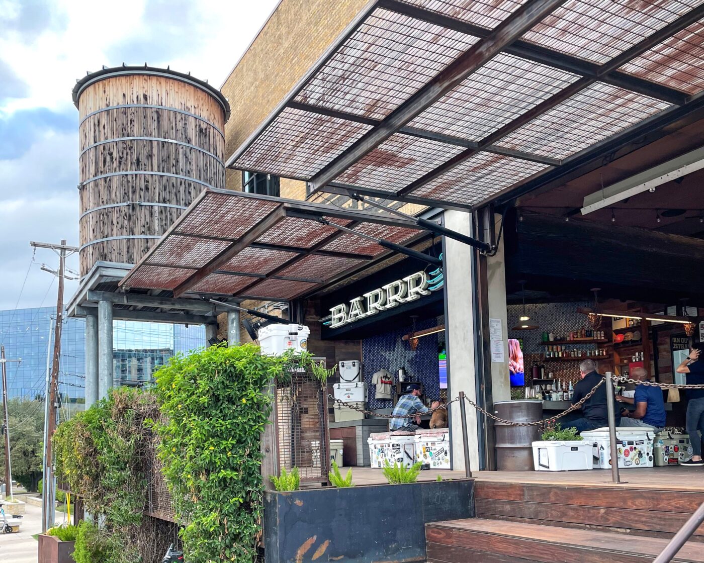
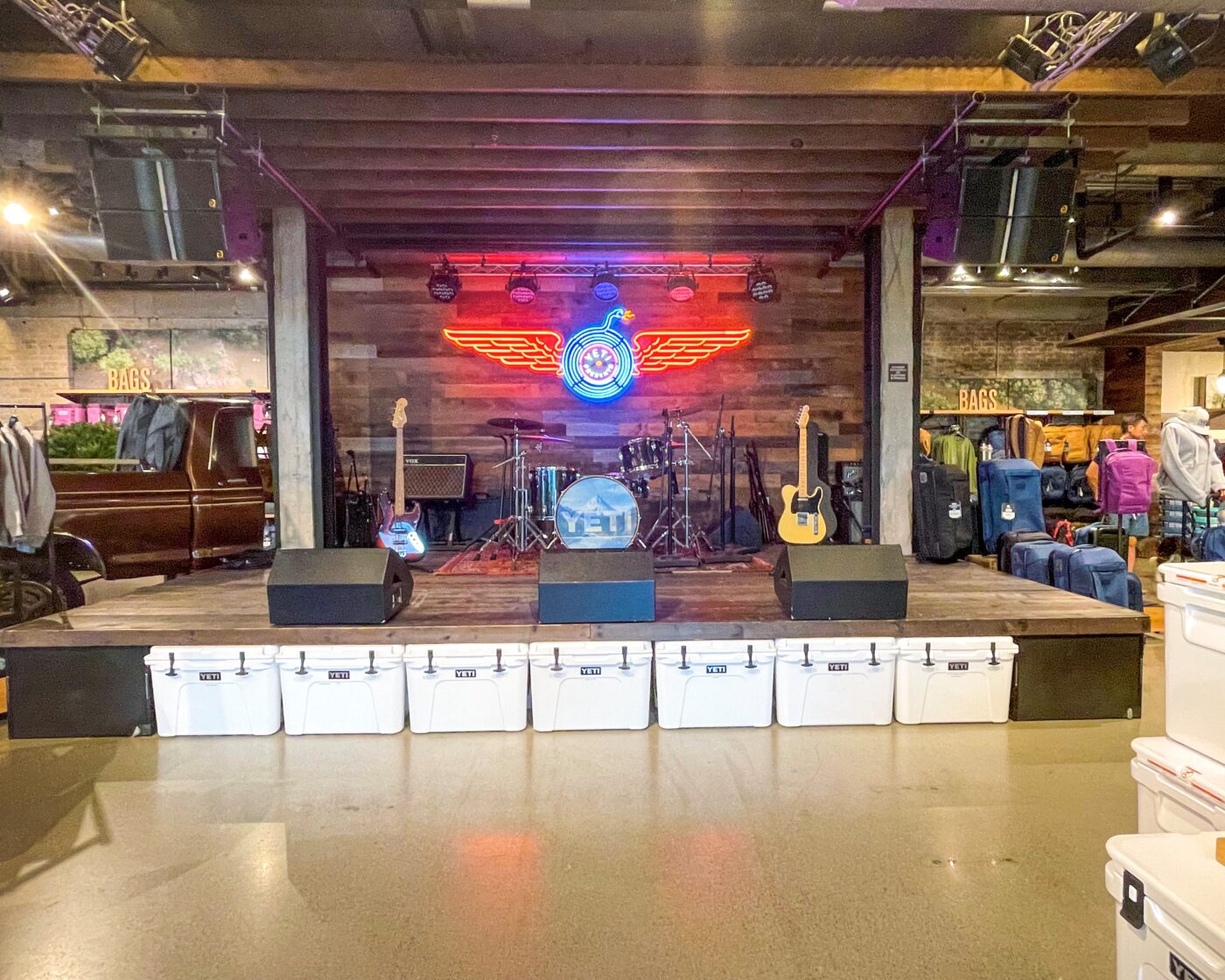
Austin is the live music capital of the world, a place full of verve and rebellious spirit. The store combines a typical retail store with that of a live music venue, anchoring the store into its local context. Inside, a music stage serves a central feature, as energetic country and rock creates a lively atmosphere, engaging customers in an authentic and festive Austin experience. The store footprint, while small, presents a wide variety of YETI’s signature products including coolers, tumblers, and backpacks.

The restroom design continues the brand’s tough and energetic aesthetic, with black steel details and ambient lighting. Architectural details like the cantilevered water tower and steel overhead doors emphasize the brand’s rough Texan roots and taps into customers’ sense of adventure.

The store makes creative use of YETI merchandise by reimagining it into furniture and unexpected branding opportunities. The patio is styled with YETI-branded lawn chairs and uses YETI coolers to create signature planters and a foosball table.
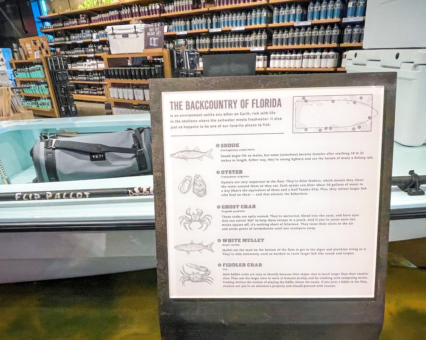
A historic fishing skiff is displayed above a shallow polycarbonate water tank in the center of the store, creating a playful engagement space for spotting different fish species. YETI’s flagship creatively connects the idea of “Texas adventure” with the YETI brand at nearly every turn.

Topics: Design, Graphic Design, Graphics


